flutter_组件
Container 组件
相当于
HTML中的div盒子!;
注意: 在 Container 中 使用 decoration 装饰 盒子 属性的时候,外面不能使用 color 属性来设置盒子背景了!
错误案例
2
3
4
5
6
7
8
9
10
child: Text('错误案例!'),
color: Colors.white,
// color 属性 和 decoration 属性 会出现冲突
decoration: BoxDecoration(
// 圆角
borderRadius: BorderRadius.circular(15)
)
)
正确案例
2
3
4
5
6
7
8
9
10
child: Text('错误案例!'),
// color: Colors.white,
// color 属性 和 decoration 属性 会出现冲突
decoration: BoxDecoration(
color: Colors.white,
// 圆角
borderRadius: BorderRadius.circular(15)
)
)
1 | Container( |
| 名称 | 功能 |
|---|---|
| topCenter | 顶部剧中对齐 |
| topLeft | 顶部左对齐 |
| topRight | 顶部右对齐 |
| center | 水平垂直居中对齐 |
| centerLeft | 垂直居中水平左对齐 |
| centerRight | 垂直居中水平右对齐 |
| bottomCenter | 底部居中对齐 |
| bottomLeft | 底部左对齐 |
| bottomRight | 底部右对齐 |
1 | decoration: BoxDecoration( |
margin属性是表示Container与外部其他组件的距离。 Edgelnsets.all(20.0),
1 | Container( |
padding就是Container的内边距,指Container边缘与Child之间的距离padding:Edgelnsets.all(10.0)
1 | Container( |
让Container容易进行一些旋转或者位移之类的transform: Matrix4.rotationZ(0.2)
1 | Container( |
设置容器的高度
1 | Container( |
设置容器的宽度
1 | Container( |
设置容器的子组件
1 | Container( |
main.dart
1 | import 'package:flutter/material.dart'; |
container.dart
1 | import 'package:flutter/material.dart'; |

Container组件 只能有一个子组件,想加入多个组件,可以配合column或者row组件 实现!
1 | Container( |
Text 组件
| 名称 | 功能 |
|---|---|
textAlign | 文本对齐方式 (center居中,left左对齐,right右对齐,justfy两端对齐) |
textDirection | 文本方向 (ltr从左至右,rtl从右至左) |
overflow | 文字超出屏幕之后的处理方式 (clip裁剪,fade渐隐,ellipsis省略号) |
textScaleFactor | 字体显示倍率 |
maxLines | 文字显示最大行数 |
style | 字体的样式设置 |
TextStyle 组件
| 名称 | 功能 |
|---|---|
decoration | 文字装饰线 (none没有线,lineThrough删除线,overline上划线underline下划线) |
decorationColor | 文字装饰线颜色 |
decorationStyle | 文字装饰线风格 ([dashed,dotted]虚线,double两根线,solid一根实线wavy波浪线) |
wordSpacing | 单词间隙 (如果是负值,会让单词变得更紧凑 |
letterSpacing | 字母间隙 (如果是负值,会让字母变得更紧凑) |
fontStyle | 文字样式 (italic斜体,normal正常体) |
fontSize | 文字大小 |
color | 文字颜色 |
fontWeight | 字体粗细 (bold粗体,normal正常体) |
Text Demo
main.dart
1 | import 'package:flutter/material.dart'; |
testDemo.dart
1 | import 'package:flutter/material.dart'; |
Image 组件
Image.network 远程图片
参数为
src
1 | Image.network(src) |
常用属性
| 名称 | 类型 | 说明 |
|---|---|---|
| alignment | Alignment | 图片的对齐方式 |
| color 和 colorBlendMode | $nbsp; | 设置图片的背景颜色,通常和colorBlendMode配合一起使用,这样可以是图片颜色和背景色混合。上面的图片就是进行了颜色的混合,绿色背景和图片红色的混合 |
| fit | BoxFit | fit属性用来控制图片的拉伸和挤压,这都是根据父容器来的。 BoxFit.fill:全图显示,图片会被拉伸,并充满父容器。BoxFit.contain:全图显示,显示原比例,可能会有空隙。BoxFit.cover: 显示可能拉伸,可能裁切,充满 (图片要充满整个容器,还不变形)。 BoxFit.fitWidth: 宽度充满 (横向充满),显示可能拉伸,可能裁切。 BoxFit.fitHeight:高度充满 (竖向充满),显示可能拉伸,可能裁切。BoxFit.scaleDown: 效果和contain差不多,但是此属性不允许显示超过源图片大小,可小不可大。 |
| repeat | lmageRepeat | 平铺: lmageRepeat.repeat: 横向和纵向都进行重复,直到铺满整个画布。ImageRepeat.repeatx: 横向重复,纵向不重复lmageRepeat.repeatY: 纵向重复,横向不重复。 |
| width | 宽度 | 宽度 一般结合ClipOval才能看到效果 |
| height | 高度 | 高度 一般结合ClipOval才能看到效果 |
Demo
1 | import 'package:flutter/material.dart'; |
main.dart
1 | import 'package:flutter/material.dart'; |
image.dart
第一种使用Container中的decoration装饰,给盒子加上圆角,并添加背景图(image: DecorationImage)!
1 | // 圆形图片 |
第二种使用
ClipOval类来实现圆形图!
1 | // 使用 ClipOval |
第三种使用
CircleAvatar类来实现圆形图!
2
3
backgroundImage: NetworkImage("imageUrl"),
),
加载本地图片
1 | Image.asset('images/a.jpeg', fit: BoxFit.cover); |
1、在根目录下新建images文件夹
注意:
images文件夹下有 >2.0x和3.0x文件夹! 每一张图片都会在2.0x和3.0x文件夹内!
2、然后在这个文件里pubspec.yaml配置下assets路径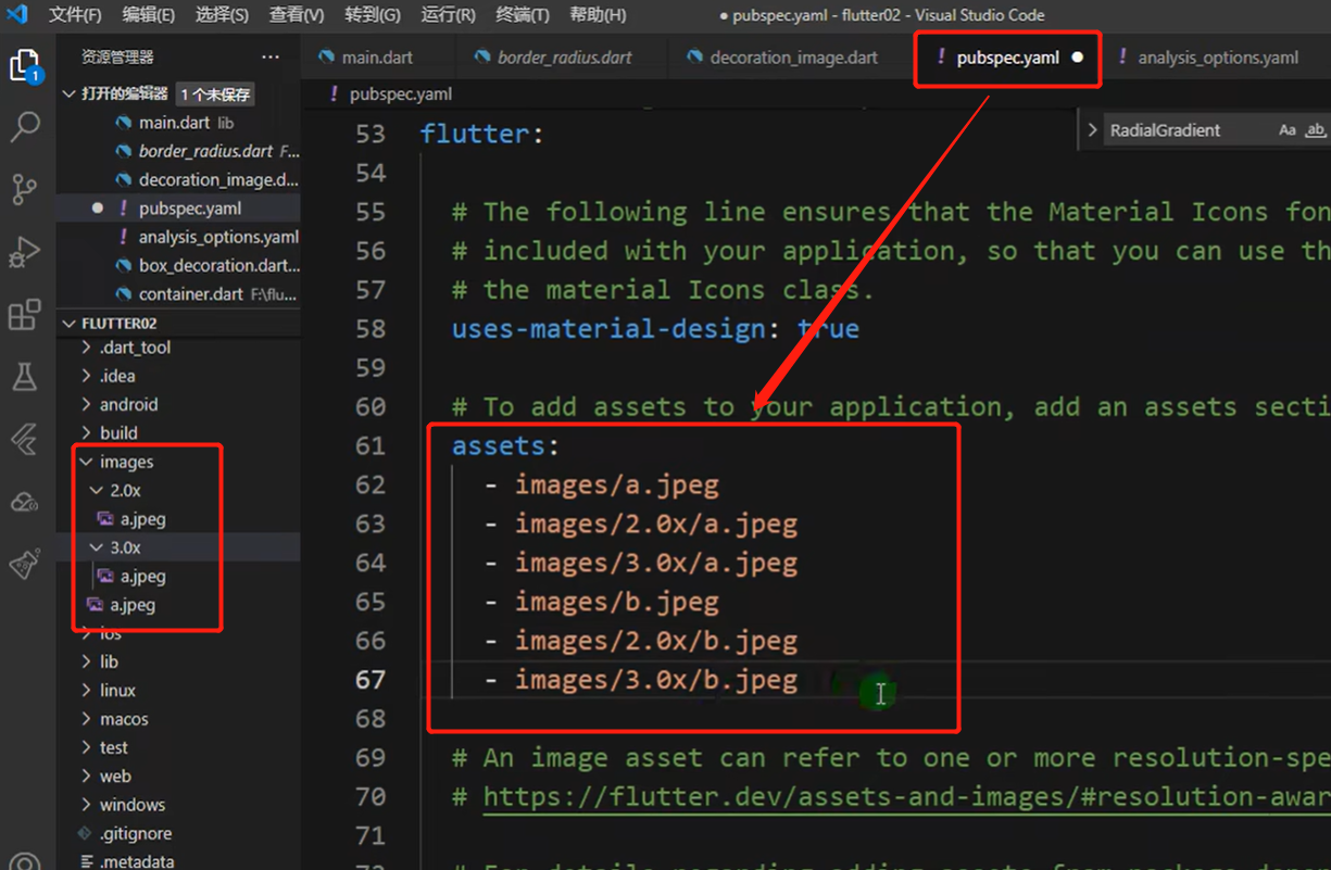
图标组件
Flutter官方
Icon网址无法正常打开,在这边网上提供了Icon的官方截图可以参照下! Icon 参考截图
内置图标
1 | import 'package:flutter/material.dart'; |
自定义图标
我们可以在这里下载我们想要的
Icon阿里图标库
1、在根目录创建fonts文件夹
2、下载的图标文件json和tff文件结尾的放入fonts文件夹内
3、在pubspec.yaml这个文件内部加入fonts配置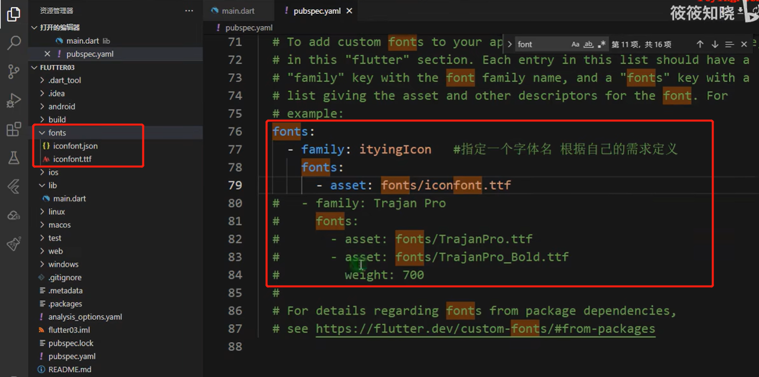
4、创建一个自定义类ityingFont
通过
IconData配置自定义Icon
5、使用ityingFont
2
3
Icon(ItyingFont.book, size: 40, color: Colors.red)注意:
.json文件内有需要unicode对应的编码!unicode编码在IconData中需要[0x3347]! 编码格式0x[unicode]。

ListView 组件
列表布局是我们项目开发中最常用的一种布局方式。Flutter中我们可以通过ListView来定义列表项,支持垂直和水平方向展示。通过一个属性就可以控制列表的显示方向。列表有以下分类:
- 垂直列表
- 垂直图文列表
- 水平列表
- 动态列表
在 [listView] 中, 当列表为 水平 方向滚动时,[Container] 下的 [height] 是自适应的,设置无效!
在 [listView] 中, 当列表为 垂直 方向滚动时,[Container] 下的 [width] 是自适应的,设置无效!
若想控制
ListView的宽高,需要借助其他组件来限制,SizeBox()orContainer()
2
3
4
5
6
7
8
9
width: 120,
height: 120,
child: ListView(
children: [
...
]
)
)
列表中常用的参数
| 名称 | 类型 | 说明 |
|---|---|---|
| scrollDirection | Axis | Axis.horizontal 水平列表 Axis.vertical 垂直列表 |
| padding | EdgelnsetsGeometry | 内边距 |
| resolve | bool | 组件反向排序 |
| children | List | 列表元素 |
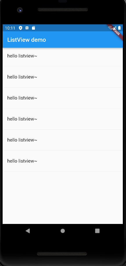
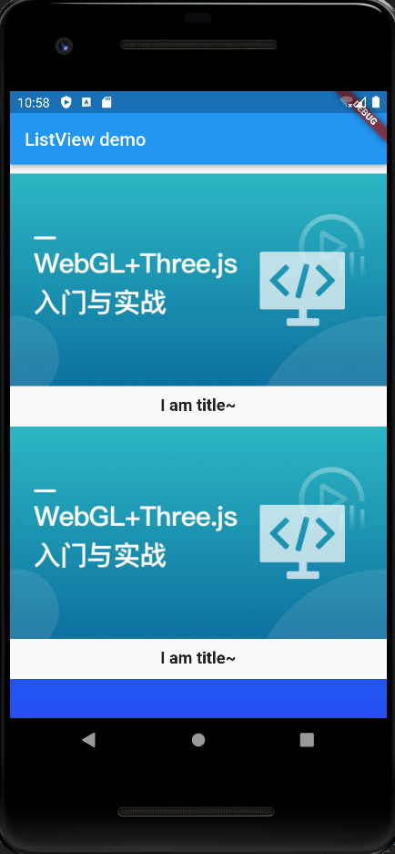
普通列表
使用
ListView和ListTile实现一个普通列表
main.dart
1 | import 'package:flutter/material.dart'; |
listView.dart1 | class MyListViewDemo extends StatelessWidget { |
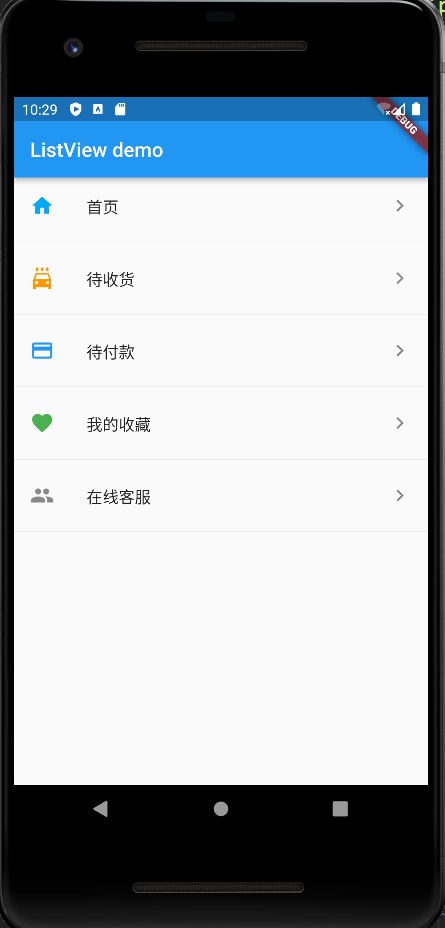
Icon列表
前置图标leading参数
后置图标trailing参数
leading参数可以实现 在列表左侧安放任意组件[image 、icon...]trailing参数可以实现 在列表右侧安放任意组件[image 、icon...]
main.dart
1 | import 'package:flutter/material.dart'; |
listView.dart1 | class MyListViewDemo extends StatelessWidget { |
图文列表
subtitle参数可以实现子标题
main.dart
1 | import 'package:flutter/material.dart'; |
listView.dart1 | class MyListViewDemo extends StatelessWidget { |
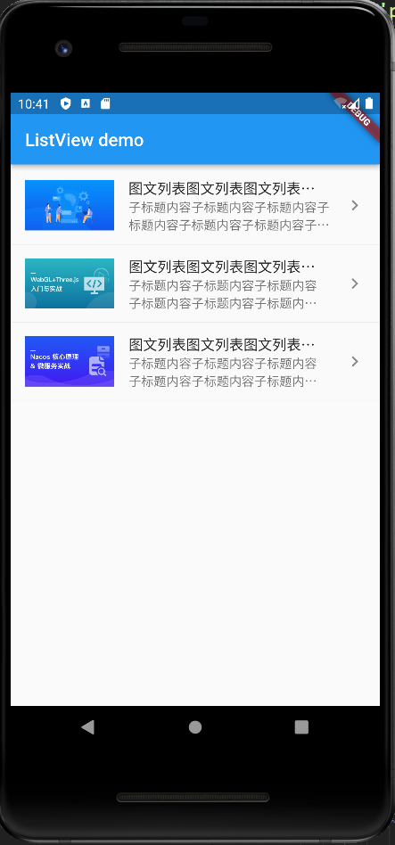
listView.dart
1 | class MyListViewDemo extends StatelessWidget { |
水平滑动列表
通过scrollDirection: Axis.horizontal此参数来控制 水平 和 垂直方向!
1 | class MyListViewDemo extends StatelessWidget { |
动态列表
通过 List 方式添加ListTile
./data/listData.dart
1 | List resData = [ |
dynamicListView.dart
1 | List<Widget> initListData(){ |
main.dart
1 | import 'package:flutter/material.dart'; |

使用ListView.builder构建生成
ListView.builder有两个参数是必须的:itemCount: 数组的长度itemBuilder: 迭代器函数,return的是widget部件!
resData 这里的数据 同 ./data/listData.dart
使用 同 ./main.dart!
结果 最终都是一样的!
1 | class MyDynamicListViewDemo extends StatelessWidget { |
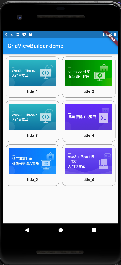
GridView 组件
GridView是网格布局组件! 有三种方式可以实现!GridView.count:crossAxisCount参数用来控制一行显示几个子组件!GridView.extent:maxCrossAxisExtent参数用来控制,每个子组件的(长度)宽度,根据宽度来分配一行可以占几个子组件!GridView.builder
通过GridView.count实现网格布局
main.dart
1 | import 'package:flutter/material.dart'; |
gridView.dart
1 | // 实现动态创建 Container 组件 |

通过GridView.extent实现网格布局
GridView.extent构造函数内部使用了sliverGridDelegateWithMaxCrossAxisExtent, 我们通过它可以快速的创建横轴子元素为固定最大长度的GridViewmaxCrossAxisExtent参数每个元素固定最大长度 为 120!
1 | class MyGridViewDemo extends StatelessWidget { |
通过GridView.builder实现动态网格布局
类似于
ListView.buildergridDelegate: 其中这个参数,需要SliverGridDelegateWithFixedCrossAxisCount和SliverGridDelegateWithMaxCrossAxisExtent这两个类来修饰!
通过这两个类,可以分别实现GridView.count和GridView.extent这两个功能!
准备数据./data/listData.dart
listData.dart
1 | List resData = [ |
main.dart
1 | import 'package:flutter/material.dart'; |
gridView.dart
1 | import './data/listData.dart'; |
常用的属性
| 名称 | 类型 | 说明 |
|---|---|---|
scrollDirection | Axis | 滚动方法 |
padding | EdgelnsetsGeometry | 内边距 |
resolve | bool | 组件反向排序 |
crossAxisSpacing | double | 水平子Widget之间间距 |
mainAxisSpacing | double | 垂直子Widget之间间距 |
crossAxisCount | int 用在 GridView.count | 一行的Widget数量 |
maxCrossAxisExtent | double 用在 GridView.extent | 横轴子元素的最大长度(设置每个子元素的宽度!) |
childAspectRatio | double | 子Widget宽高比例 默认为 [1 正方形] [> 1 高矮 宽长] [< 1 高长 宽窄 ] |
children | Widget List | [] |
gridDelegate | SliverGridDelegateWithFixedCrossAxisCount 和 SliverGridDelegateWithMaxCrossAxisExtent | 控制布局主要用在GridView.builder里面 |
页面布局组件
padding 组件
给内容四周加上边距!
Container 组件
1 | Container( |
Padding 组件1 | Padding( |
注意: 如果只是单方面给文本加 边距 的话 推荐使用 Padding 组件,相对于 Container组件 来说,Padding 组件内存占用少!
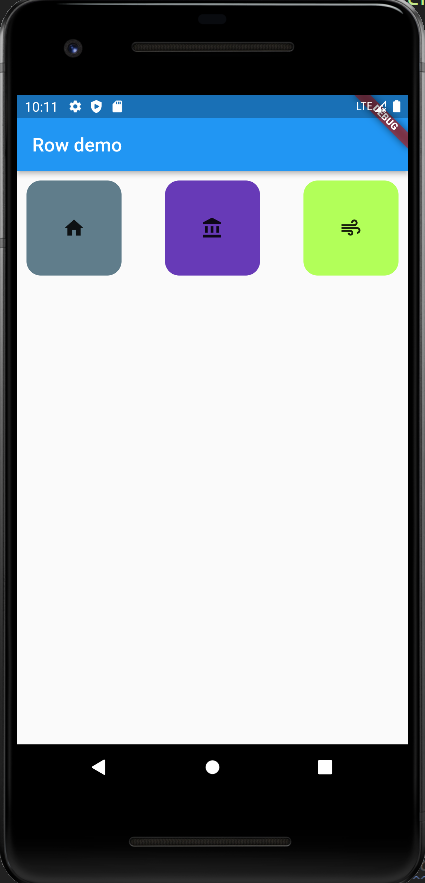
Row 组件
Row 组件 如果没有 Container 组件包裹,就是自适应的,如果被 Container 包裹,那自适应就相对于 Container组件!水平布局 组件
width宽度自适应
| 属性 | 说明 |
|---|---|
mainAxisAlignment | 横(水平)轴的排序方式 |
crossAxisAlignment | 纵(垂直)轴的排序方式 |
children | 组件元素 [] |
main.dart
1 | import 'package:flutter/material.dart'; |
row.dart
1 | import 'package:flutter/material.dart'; |
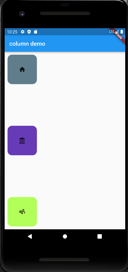
Column 组件
垂直布局 组件
height高度自适应, 参数属性 基于Row相似!
1 | import 'package:flutter/material.dart'; |
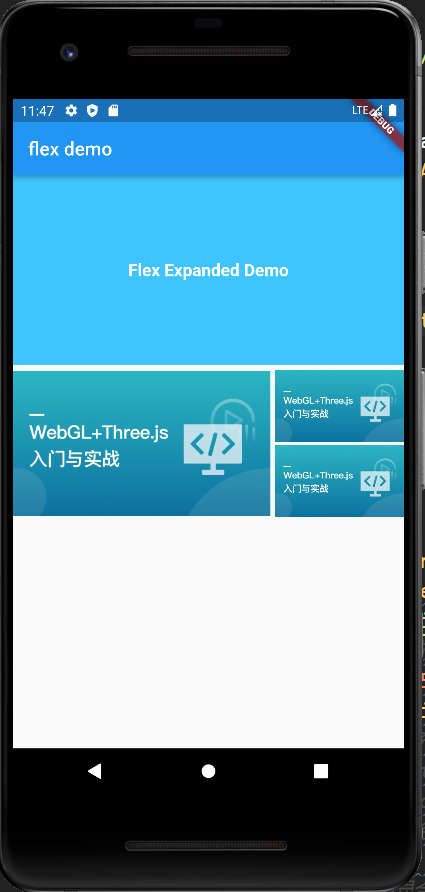
Flex 组件
Flex组件可以沿着水平或垂直方向排列子组件,如果你知道主轴方向,使用Row或column会方便些,因为Row和column都继承自Flex,参数基本相同,所以能使用Flex的地方基本上都可以使用Row或column。Flex本身功能是很强大的,它也可以和Expanded组件配合实现弹性布局。
1 | `flex.dart` 在 `main.dart` 引入即可! |
这里的效果 与 下边 Row 水平方向 Expanded 效果一至的!
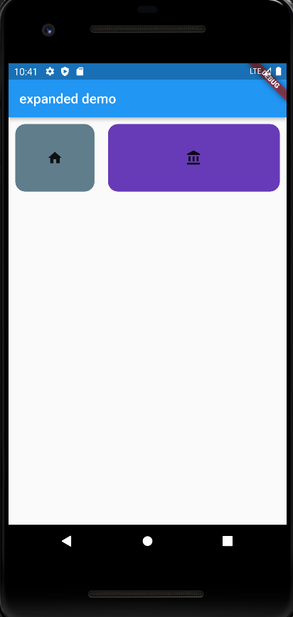
Expanded 组件
Expanded组件内 的child组件 无论设置宽高都是无效的,最终以flex为优先最高!
main.dart
1 | import 'package:flutter/material.dart'; |
expanded.dart
1 | import 'package:flutter/material.dart'; |
row:
这块实现的是 row 方向的排列布局!
column:
想要实现纵向排列,通过 `column` 替换掉 `row` 即可!
怎么实现一个右侧固定 左侧自适应的呢
固定那边的元素 可以不使用
Expanded即可!
1 | class MyExpandedDemo extends StatelessWidget { |
Flex Expanded 组件 Demo
flexExpandedDemo.dart
1 | import 'package:flutter/material.dart'; |
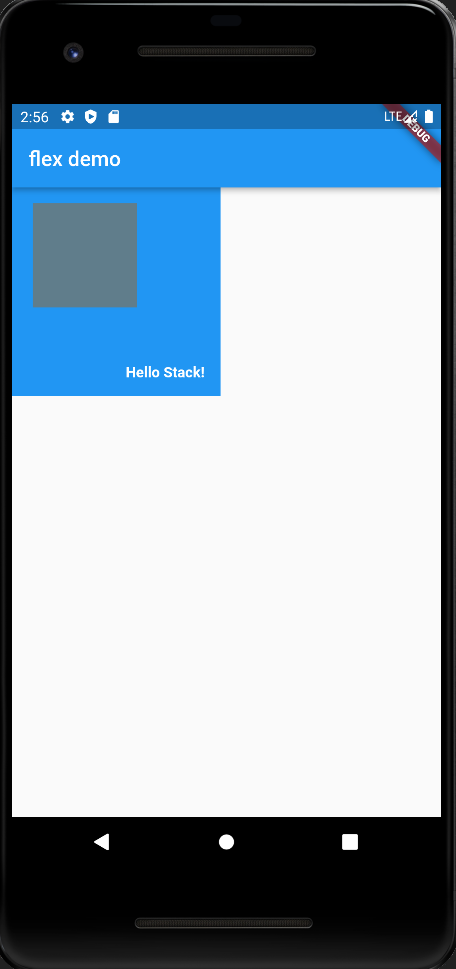
Stack 层叠组件
通过
Stack组件 可以实现元素堆叠!,配合Positioned组件 可以实现元素定位!Positioned被定位的元素是相对于外部容器定位,如果没有外部容器就相对于整个屏幕定位的!
属性
| 属性 | 说明 |
|---|---|
alignment | 配置所有子元素显示的位置 |
children | 子组件集合 |
stack.dart
1 | // 层叠组件 配合 position 和 align 实现 定位布局 |

Stack 与 Positioned
Positioned组件 可以设置 子组件lefttoprightbottomchildwidthheight!Positioned组件中内部子组件 如果是Row行组件的话 需要设置宽度和高度!
注意:Positioned中的width参数 无法设置double.infinity,若想设置屏幕的宽度和高度的话需要借助MediaQuery了!
注意:宽度和高度必须是固定值 没法使用double.infinity!
stack.dart
1 | // 层叠组件 配合 position 和 align 实现 定位布局 |
MediaQuery 获取设备的宽度和高度final size = MediaQuery.of(context).size
1 | class MyStackAppDemo extends StatelessWidget { |
注意:
stack组件 是没有确定性宽高的,所以需要使用确定宽高的容器[SizeBox] 和 [Container] 来包裹! 这样在做定位的时候,就有相对的容器可以定位!stack组件 是可以 直接 在跟节点使用的,这样他的相对定位的容器,是整个应用界面!
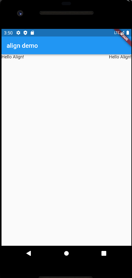
Align 组件
Align组件可以调整子组件的位置,Stack组件中结合Align组件也可以控制每个子元素的显示位置Align参数:alignment: 配置所有子元素的显示位置child: 子组件
Contaienr 中使用 Align
之前文本居中 是这么操作的!
1 | Container( |
使用
Align组件
1 | Container( |
Alignment 不仅可以使用静态属性 还可以通过参数来指定方位alignment:Alignment(1,1) //右下 方位alignment:Alignment(-1,1) //左下 方位算法: Alignment.x*childwidth/2+childwidth/2,Alignment.y*childHeight/2+childHeight/2)
1 | Container( |
Stack and Align Demo
align.dart
1 | import 'package:flutter/material.dart'; |
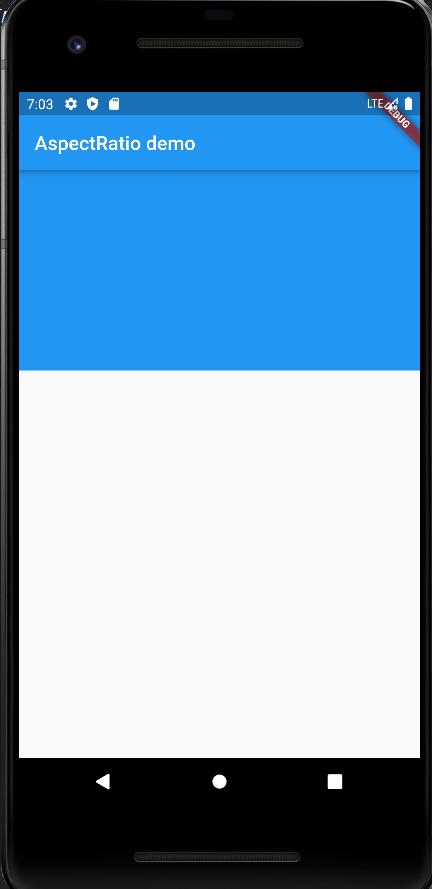
AspectRatio
设置子元素的 宽高比
AspectRatio: 的作用是根据设置调整子元素child的宽高比。AspectRatio: 首先会在布局限制条件允许的范围内尽可能的扩展,widget的高度是由宽度和比率决定的,类似于BoxFit中的contain,按照固定比率去尽量占满区域。
如果在满足所有限制条件过后无法找到一个可行的尺寸,AspectRatio最终将会去优先适应布局限制条件,而忽略所设置的比率。
| 属性 | 说明 |
|---|---|
aspectRatio | 宽高比,最终可能不会根据这个值去布局,具体则要看综合因素,外层是否允许按照这种比率进行布局,这只是一个参考值 |
child | 子组件 |
aspectRatio.dart
aspectRatio.dart
1 | // 控制子元素的宽高比 |
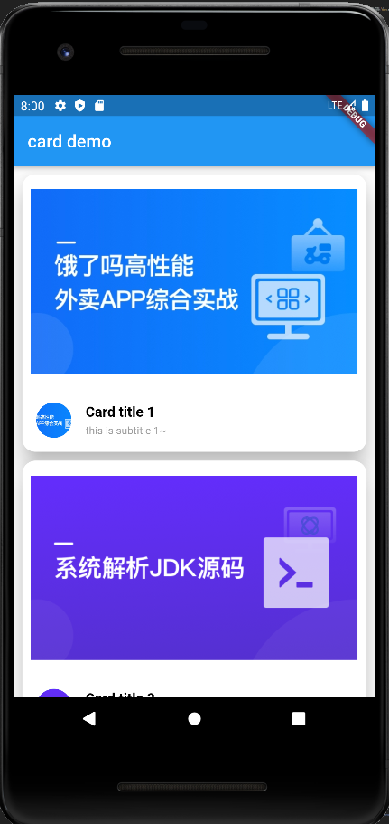
Card 组件
Card是卡片组件块,内容可以由大多数类型的Widget构成,Card具有圆角和阴影,这让它看起来有立体感。
| 属性 | 说明 |
|---|---|
margin | 外边距 |
child | 子组件 |
elevation | 阴影值的深度 |
color | 背景颜色 |
shadowColor | 阴影颜色 |
clipBehavior | clipBehavior 内容溢出的剪切方式 Clip.none不剪切 Clip.hardEdge裁剪但不应用抗据齿 Clip.antiAlias裁剪而且抗据齿 Clip.antiAliasWithSaveLayer带有抗锯齿的剪辑,并在剪辑之后立即保存saveLayer |
Shape | Card的阴影效果,默认的阴影效果为圆角的长方形边。 shape: const RoundedRectangleBorder(borderRadius: BorderRadius.all(Radius.circular(10))) |
aspectRatio.dart
cart.dart
1 | // 实现一个 卡片式布局 |
CircleAvatar 组件
CircleAvatar可以实现一个圆形图片
有两个属性:radius: 设置圆的半径backgroundImage: 背景图片backgroundImage: NetworkImage('src')backgroundColor: 背景颜色
1 | CircleAvatar( |
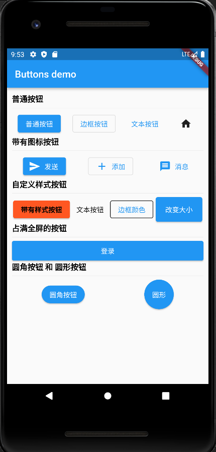
Button 组件
普通按钮[ElevatedButton]
1 | ElevatedButton(onPressed: (){}, child: Text('普通按钮')), |
文本按钮[TextButton]
1 | TextButton(onPressed: (){}, child: Text('文本按钮')), |
边框按钮[OutlineButton]
1 | OutlinedButton(onPressed: (){}, child: Text('边框按钮')), |
图标按钮[IconButton]
1 | IconButton(onPressed: (){}, icon: Icon(Icons.home)) |
带有图标的按钮
通过icon构造函数可以实现带有图标的按钮
1 | ElevatedButton.icon(onPressed: (){}, label: Text('发送'), icon: const Icon(Icons.send)), |
自定义按钮样式
通过style: ButtonStyle()参数可以实现带有样式的按钮
可以修改按钮的
背景颜色,文本颜色,阴影,内边距等样式…
1 | ElevatedButton( |
设置按钮的宽高
此时需要使用
ContainerorSizeBox来控制按钮的大小!
1 | Container( |
占满全屏的按钮
1 | Row( |
圆角按钮 和 圆形按钮
1 | Row( |
buttons.dart
1 | import 'package:flutter/material.dart'; |
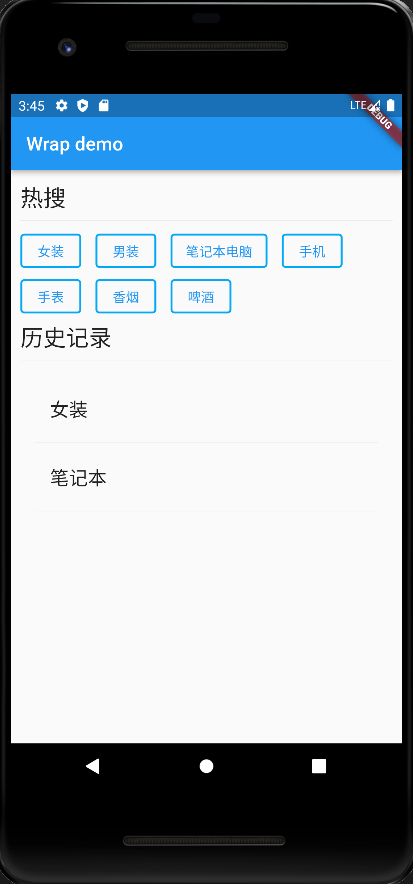
wrap 组件
wrap组件 是Column和Row组合,有所不同的是,一行元素,当没有剩余空间时,可以自动折行!Wrap可以实现流布局,单行的Wrap跟Row表现几乎一致,单列的Wrap则跟Column表现几乎一致。但Row与Column都是单行单列的,Wrap则突破了这个限制,mainAxis上空间不足时,则向crossAxis上去扩展显示。
属性
| 属性 | 说明 |
|---|---|
direction | 主轴的方向,默认水平 |
alignment | 主轴的对其方式 |
spacing | 主轴方向上的间距 |
textDirection | 文本方向 |
verticalDirection | 定义了children摆放顺序,默认是down,见Flex相关属性介绍. |
runAlignment | run的对齐方式。run可以理解为新的行或者列,如果是水平方向布局的话run可以理解为新的一行 |
Wrap Demo
wrapDemo.dart
1 | import 'package:flutter/material.dart'; |
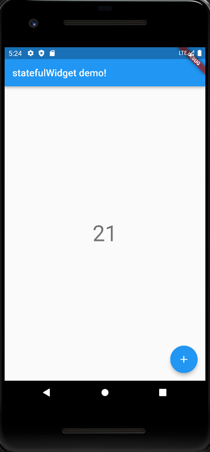
StatefulWidget 有状态组件
通俗的讲: 如果我们想改变页面中的数据的话这个时候就需要用到
StatefulWidget!StatelessWidget无法监听到数据的变化,并实时将数据更新到界面!
通过Demo实现一个 计数器
注意:setState(() {});这个方法每次触发后都会重新执行一遍Widget build!
main.dart
1 | import './statefulWidget.dart'; |
statefulWidget.dart1 | import 'package:flutter/material.dart'; |
Scaffold 组件
BottomNavigationBar 底部导航栏组件
属性
| 属性名 | 描述 |
|---|---|
items | List 底部导航条按钮集合 |
iconSize | icon 大小 |
currentIndex | 默认选中第几个 |
onTap | tab 栏 点击事件 |
fixedColor | 选中的颜色 |
type | 如果 底部菜单 超过四个以上的话需要配置 type: BottomNavigationBarType.fixed or BottomNavigationBarType.shifting |
Demo
- 在
lib目录下新建文件夹pages/tabs - 新建三个组件:
home.dartsetting.dartmine.dart
home.dart
1 | // Home page |
setting.dart
1 | // setting page |
mine.dart
1 | // mine page |
在bottomNavigationBar.dart中分别引入以上三个组件!
bottomNavigationBar.dart
1 | // bottomNavigationBar 实现一个底部 Tab 栏 |
main.dart
1 | import './bottomNavigationBar.dart'; |

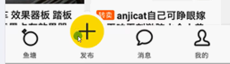
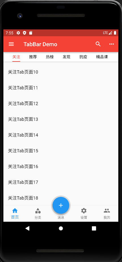
FloatingActionButton 浮动按钮组件
FloatingActionButton浮动按钮组件 在实现 计数器的时候用到过,这里配合BottomNavigationBar底部Tab组件实现中间突起按钮!
效果图
借助 Scaffold中的参数floatingActionButtonLocation来实现按钮位置更换!
main.dart
main.dart
1 | import './floatingActionButton.dart'; |
floatingActionButton.dart
1 | import 'package:flutter/material.dart'; |

Drawer 侧边栏组件
drawer: 可以配置 左侧 侧边栏!endDrawer: 可以配置 右侧侧边栏!
DrawerHeader 组件
属性
| 属性 | 描述 |
|---|---|
decoration | 设置顶部背景颜色 |
child | 配置子元素 |
padding | 内边距 |
margin | 外边距 |
UserAccountsDrawerHeader 组件
| 属性 | 描述 |
|---|---|
decoration | 设置顶部背景颜色 |
accountName | 账户名称 |
accountEmail | 账户邮箱 |
currentAccountPicture | 用户头像 |
otherAccountsPictures | 用来设置当前账户其他账户头像 |
margin | 外边距 |
不同设备调试
flutter run后根据提示,可在 控制台选择!
1 | flutter run |
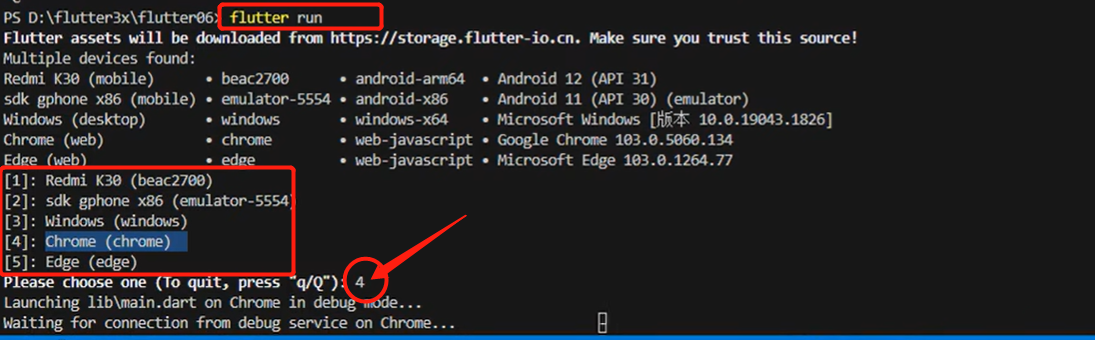
1 | flutter run -d chrome // 指定设备 |
vscode 右下角 会有个设备选择!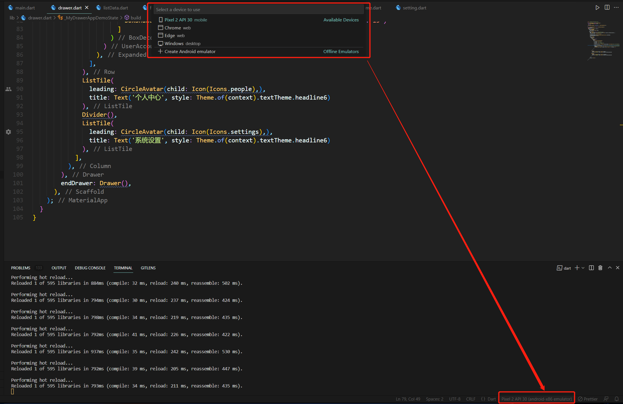
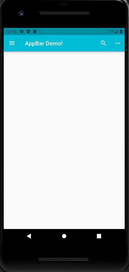
AppBar 组件
leading可以配置 左侧IconButton;actions可以配置 右侧Button!
属性
| 属性 | 说明 |
|---|---|
leading | 在标题前面显示的一个控件,在首页通常显示应用的 logo; 在其他界面通常显示为返回按钮 |
title | 标题,通常显示为当前界面的标题文字,可以放组件 |
actions | 通常使用 IconButton 来表示,可以放按钮组 |
bottom | 通常放tabBar,标题下面显示一个 Tab 导航栏 |
backgroundColor | 导航背景颜色 |
iconTheme | 图标样式 |
centerTitle | 标题是否居中显示 |
elevation | 改变阴影的模糊深度! |
控制 AppBar 的高度
PreferredSize借助此类实现 控制AppBar高度!
1 | appBar: PreferredSize( |
1 | import 'package:flutter/material.dart'; |
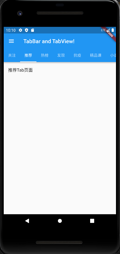
TabBar 和 TabBarView 组件
属性
| 属性 | 说明 |
|---|---|
tabs | 显示的标签内容,一般使用Tab对象,也可以是其他的Widget |
controller | TabController对象 |
isScrollable | tab 标签多了是否可滚动 |
indicatorColor | 指示器颜色 |
indicatorWeight | 指示器宽度 |
indicatorPadding | 底部指示器的Padding |
indicator | 指示器decoration,例如边框等 |
indicatorSize | 指示器大小计算方式,TabBarIndicatorSize.label跟文字等宽TabBarIndicatorSize.tab跟每个tab等宽 |
labelColor | 选中label颜色 |
labelStyle | 选中label的Style |
labelPadding | 每个label的padding值 |
unselectedLabelColor | 未选中label颜色 |
unselectedLabelStyle | 未选中label的Style |
注意:
在实现功能前需要
with混入下with SingleTickerProviderStateMixin这个类! 因为我们需要获取到_tabControllertab 控制器!;_tabController这个控制器我们需要在TabBar(controller: _tabController)和TabBarView(controller: _tabController)中当作参数应用!tabBar中的tabs里的内容数量 要和TabBarView中的children里的数量保持一致!
1 | import 'package:flutter/material.dart'; |
组件什么时候销毁:
当触发页面切换,比如切换 BottomNavigationBar 底部 Tab 栏的时候 ,tabBarController 就会销毁!
main.dart
main.dart
1 | import './tabBarAndTabView.dart'; |
tabBarAndTabView.dart
tabBarAndTabView.dart
1 | import 'package:flutter/material.dart'; |
TabBar 和 TabBarView 事件监听第一种 利用 TabBar 中的 _tabController.addListener((){})
这里
滑动和点击都可以监听到!
2
3
4
5
6
7
8
9
10
11
12
13
14
15
16
17
18
19
20
void initState() {
// TODO: implement initState
super.initState();
// length: 9 这个长度 是用来控制 tabBar 和 tabView tab标签数量的!
// tabBar 中的 tabs 和 tabView 的页面数量一定要对应上
_tabController = TabController(length: 9, vsync: this);
// 监听 tab 事件
_tabController.addListener(() {
// 这里会打印两边,因为 切换 进入 和 离开的时候 都会各触发一次
print(_tabController.index);
// 处理方案
// animation!.value 值可能为空,加上 ! 感叹号 在不为空的时候获取
if (_tabController.animation!.value == _tabController.index) {
// 这里只会触发一次
print(_tabController.index);
}
});
}
第二种 在 TabBar 中 加入 onTab(){}事件
这里 只有在
点击的时候会触发,不支持滑动触发!
2
3
4
5
onTab( index ){
// 只能监听点击事件 无法监听 滑动
}
)
KeepAliveWrapper 缓存界面
AutomaticKeepAliveClientMixin可以快速的实现页面缓存功能,但是通过混入的方式实现不是很优雅,所以我们有必要对AutomaticKeepAliveClientMixin混入进行封装keepAlive: 是否缓存child: 缓存的子组件KeepAliveWrapper.dart
2
3
4
5
6
7
8
9
10
11
12
13
14
15
16
17
18
19
20
21
22
23
24
25
26
27
28
29
30
31
class KeepAliveWrapper extends StatefulWidget {
const KeepAliveWrapper(
{Key? key, this.child, this.keepAlive = true})
: super(key: key);
final Widget? child;
final bool keepAlive;
State<KeepAliveWrapper> createState() => _KeepAliveWrapperState();
}
class _KeepAliveWrapperState extends State<KeepAliveWrapper>
with AutomaticKeepAliveClientMixin {
Widget build(BuildContext context) {
return widget.child!;
}
bool get wantKeepAlive => widget.keepAlive;
void didUpdateWidget(covariant KeepAliveWrapper oldWidget) {
if (oldWidget.keepAlive != widget.keepAlive) {
// keepAlive 状态需要更新,实现在 AutomaticKeepAliveClientMixin 中
updateKeepAlive();
}
super.didUpdateWidget(oldWidget);
}
}
头条顶部 AppBar 滑动案例
AppBarTabBarTabBarView三种组件结合完成Demo实例!
widget tab(tabView.dart)
在
libs/widget/tabView.dart封装tabBar 和 tabBarView组件!
tabView.dart
注意: 在tabView.dart里引入KeepAliveWrapper.dart
1 | import 'package:flutter/material.dart'; |
pages tab(home.dart,categroy.dart,message.dart,mine.dart,setting.dart)
在
lib/pages/tabs/新建这几个页面!
home.dart
注意: 在home.dart里引入tabView.dart
1 | // Home page |
categroy.dart
1 | // Categroy page |
message.dart
1 | // message page |
mine.dart
1 | // mine page |
setting.dart
1 | // setting page |
在lib/tools/创建 KeepAliveWrapper.dart
KeepAliveWrapper.dart用来缓存用户界面状态的,比如: 用户在第一个界面浏览内容到最下方,这时候切换到别的界面,在切换会原页面,此时状态不会消失,应保持原有状态!(最初浏览到最下方的状态!)
KeepAliveWrapper.dart
1 | import 'package:flutter/material.dart'; |
在main.dart引入tabBarAndTabViewDemo.dart
main.dart
1 | import 'package:flutter/material.dart'; |
InkWell 点击组件
内部包含的组件 变为可点击效果!
可点击 长按 等触发事件效果!
1 | InkWell( |
 微信
微信